Tread Mobile & Web Product Design
Assignment
Experience the UX/UI Design Thinking Process Creating a Mobile-Web Product in 90 Hours
Details
Springboard UX/UI Design Program
Capstone Two Project: Mobile-Web Design
Stakeholder: Rain Lieberman
Tools: Sketch & InVision Studio
Role
Sole UX/UI Designer
The Problem
An e-commerce bike company is having problems with the conversion from browse to completion of checkout and is losing out on revenue opportunities. Data shows that two friction points in the shopper’s experience are resulting in users not completing the purchase. The first friction point is 50% of users open on average seven-item pages and then abandon the site without moving any items into the cart. The hypothesis is that users are unable to determine which bike is best based on relative features. The second friction point is 70% of users who place an item in the cart do not purchase. Data shows that users abandon the cart at the registration page. Right now, users must create an account to purchase leaving extra steps in the user’s experience.
The Solution
Using the design thinking methodology, empathy, define, ideate, prototype, and test, I eliminated the friction points by introducing four new features to the website. For the first enhancement, I created a three-step questionnaire that steers the user into the correct bike for their needs by asking the right questions. For the second enhancement, I introduced a tool that allows the user the ability to live chat with a specialist. The specialist will ask appropriate questions to gather the information that will allow the specialist to create a unique list of bikes that best fits the user’s needs. The third enhancement is the ability to use a virtual video chat tool with a live specialist. This tool will allow the user to receive one-on-one attention as if they were in an actual brick-and-mortar bike shop. The specialist could even show the user bikes and go over the features while on video. At the end of the meeting, the specialist will generate a unique page with the bikes that best fit the user’s needs. For the fourth and final enhancement, I created a guest checkout option streamlining the checkout process making it much easier and faster for the user to complete the sale.
My Role
As the only UX Designer assigned to this project, I worked on every aspect: market and user research, research analysis, ideation, design, branding, prototyping, and testing.
Project Plan
90 Hours
Time management was important for this project. I had 90 total hours from start to finish. I carefully allocated the appropriate time for each step in the process to ensure all deadlines were kept.
Exploration
Industry Leaders
To start this project, I audited three industry leaders in the e-commerce bike shopping experience to determine what these digital products are doing well and what they’re doing poorly. I found that the three stores had very different user experiences that included a CTA that allowed one-click purchase, annoying popups that frustrate the user, and beautiful UI but lacks empathy.
Research Questions
For me to understand the motivations and behaviors of bikers I needed to understand their pain points, I wanted to speak directly with them. After screening about 20 people, I narrowed down the list and conducted structured interviews with five avid bikers. The finding from these interviews will serve as the foundation of my qualitative data throughout this assignment.
Survey & User Interviews
After conducting the survey and interviews, it became obvious that people are willing to purchase expensive bikes online but, the users did feel like talking to a specialist at a bike shop is important for making the correct purchase decision. The test participants didn’t enjoy or have time to properly research bikes which caused a lack of confidence and hesitation to complete the online sale. To increase sales, an online tool will be needed to quickly educate the users.
Key Findings:
Users believe they get the best price online
Assembly is quick and easy
Getting the correct size is tough
Test drives are important
Bike shops have limited selections
Better selection online
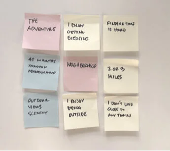
Empathy Mapping
Through the empathy mapping process, it became clear that the users’ purchasing needs aligned and could be represented with one persona.
Persona
Meet Brady, he’s a 28 years Graphic Designer that loves riding his bike through the neighborhood after work almost every day. He needs a new bike but doesn’t enjoy shopping or researching. He lacks confidence in his next purchase and needs help finding the perfect bike.
Ideate
Turning Research into Design
At this point, I have all of the data and insight I need and I’m able to empathize with the user to understand their needs. Using this information while building the designs will ensure the product will be function properly and have an excellent user experience.
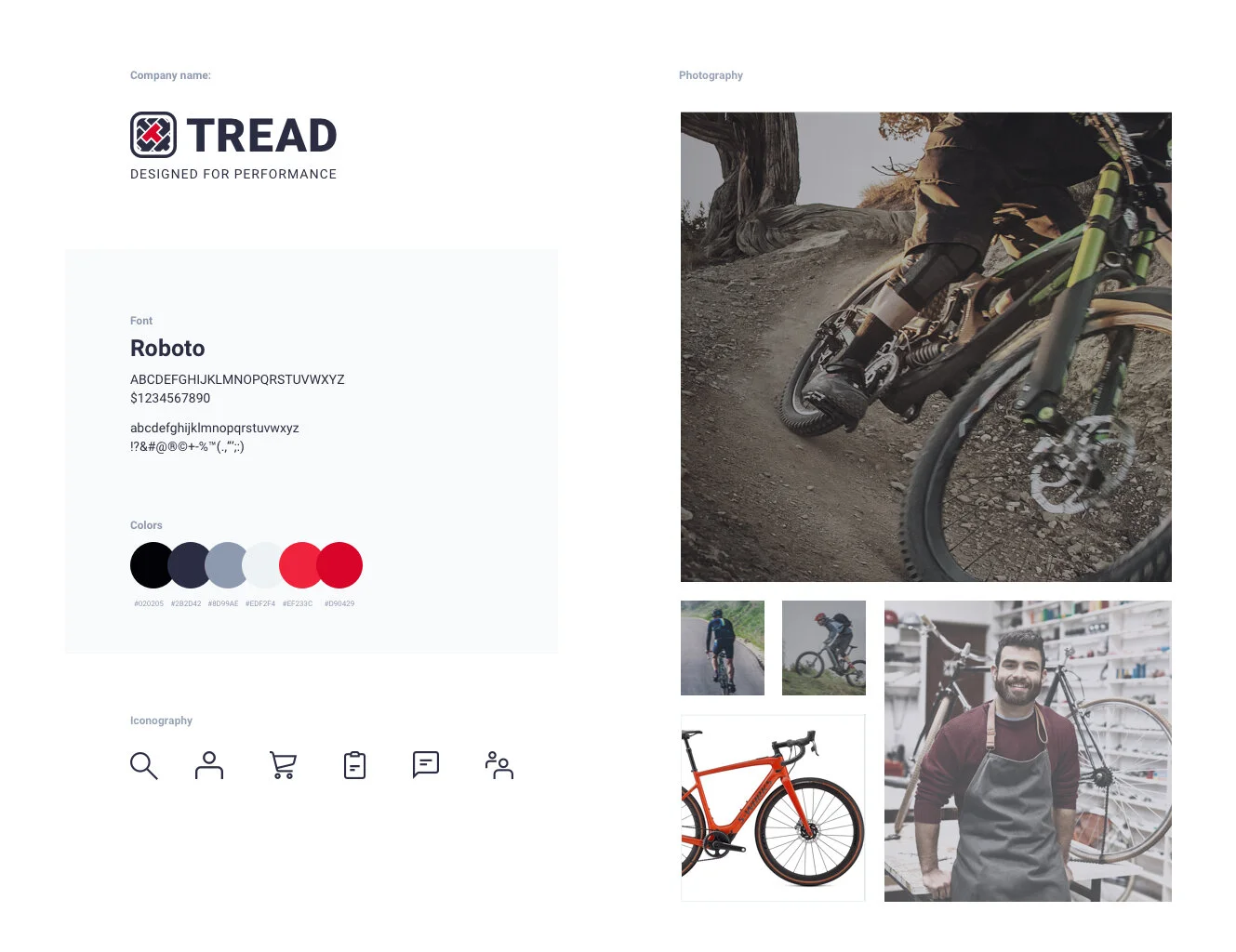
Style Guide
The brand’s personality – an expert in the field who is always knowledgeable about the very latest trends and best products related to biking.
Brand Attributes
Savvy
Focused
Serious
Dependable
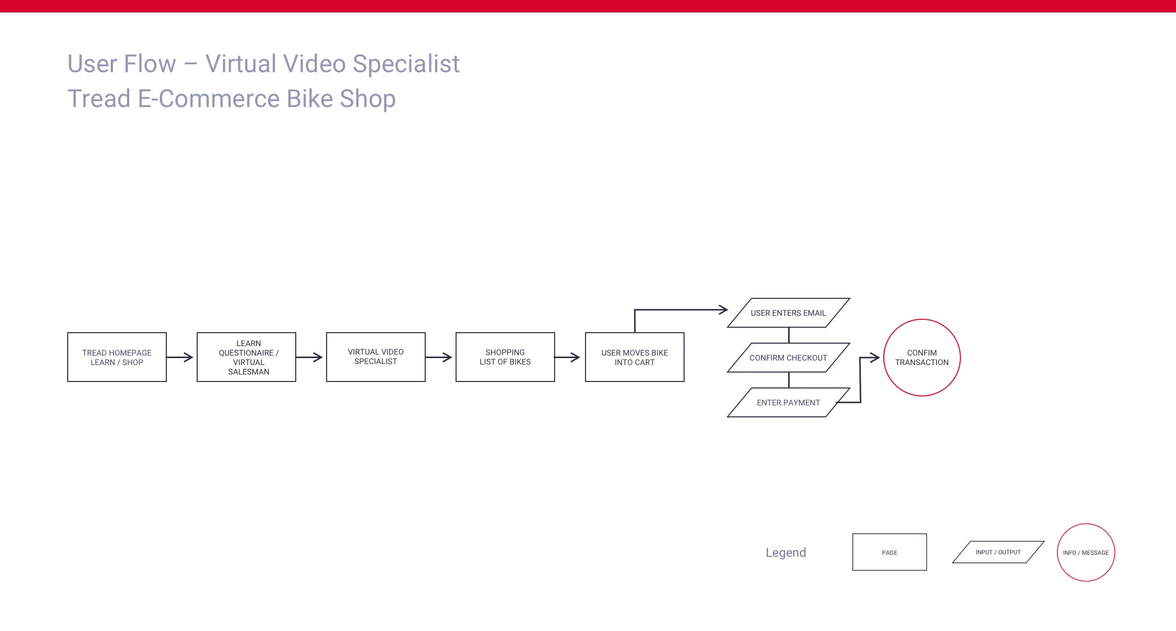
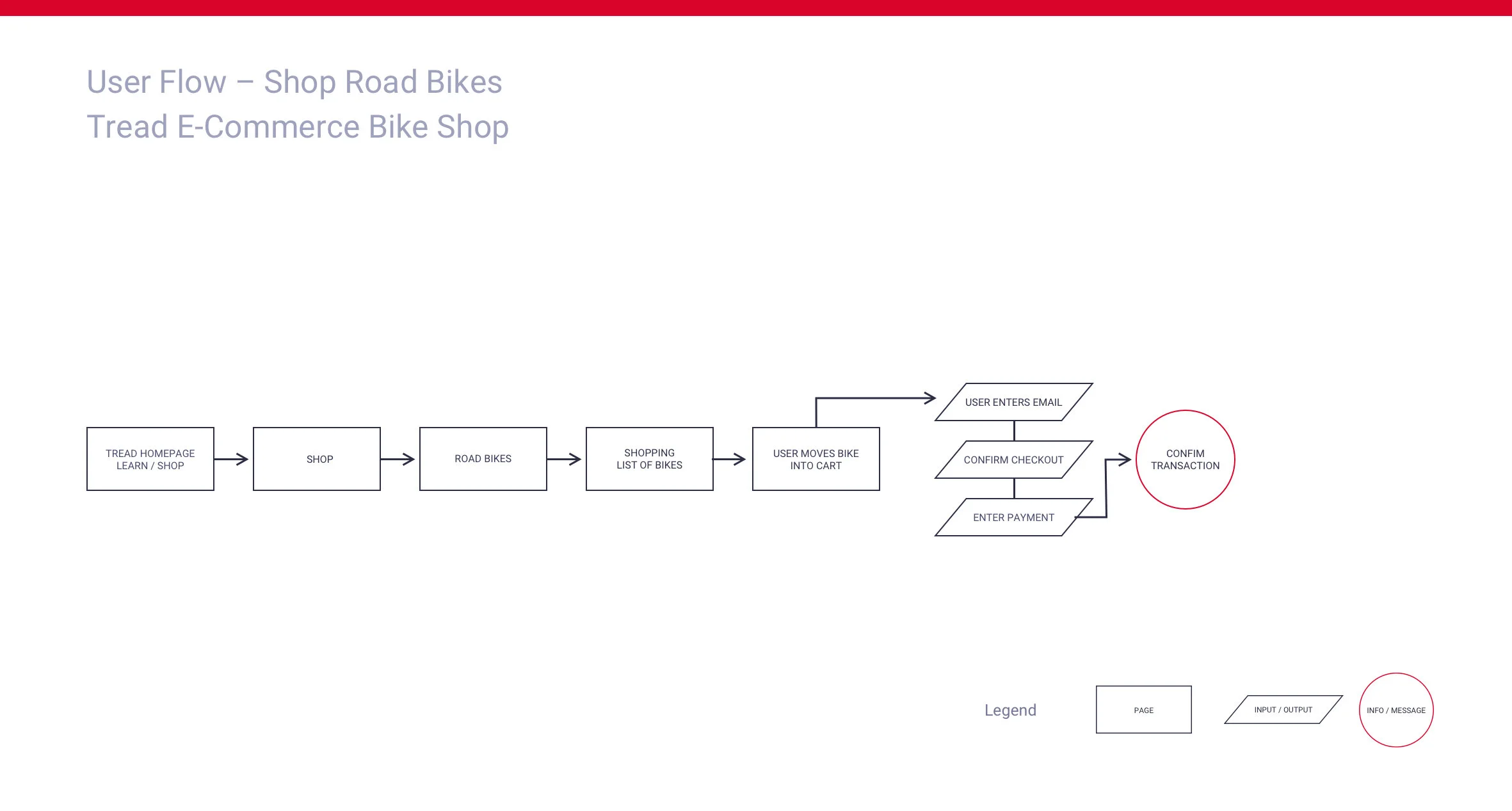
User Flows
Interview data showed that users are unable to determine which bike is best based on relative features. The user flows solves this by giving the user 2 options that will educate them and help make the correct purchase decision. The user flows will also help checkout conversion with a guest checkout option. 70% of users who place an item in the cart do not purchase. Users abandon the cart at registration.
Low Fidelity Designs & Sketching
As my sketches took shape, the website started to capture the brand’s personality and vision. I will use these to prototype the user experience and use these findings when I build high-fidelity designs.
Low Fidelity Prototyping & User Testing
With the sketches complete and a prototype ready for testing I wrote a script and recruited 3 participants. During testing, I found that I was missing a critical component in the website. The users wanted to compare the features of the bikes that they were considering purchasing. I will be sure to work this into the next round, high-fidelity designs. Other than that the website did perform very well.
Key Findings
The website was missing a comparison tool
The virtual specialist was a big hit
The option to use the questionnaire to save time also went over well
Overall the website performed well
High Fidelity Prototyping & User Testing
During usability testing, a few issues emerged in the product. User A, Ryan thought the learn CTA was a bit confusing. He also didn’t know his bike size and didn’t see a sizing tool to find it. User C, Sarah loved the specialist tools but, was unable to find the links to the bike. Currently, you’d have to hang up on the video chat and click on the link provided in the text chat to advance to the bike pages. This was not obvious enough. The final issue was the missing purchase confirmation. The user wasn’t sure if the transaction had actually gone through.
Key findings:
The “LEARN” CTA was not clear and needed to be changed.
The CTA was missing on the video chat
The CTA was missing on the text chat
The size chart tool was missing from the product
The purchase confirmation was missing after the user placed the order
High Fidelity Designs
Synthesizing all of the research, user testing, and style guide components to create the UI for the product was an exciting part of the process. I wanted the brand to communicate savvy, focus, serious and dependability with a simple and clean layout. The navigation is logical and follows best practices. The use of action photography with the bike as the focal point helps define the aesthetic. Simple UI elements make it easy for the user and ensure an enjoyable experience.
High Fidelity Design Iterations
Iterations were minor to the high fidelity product but as always, small changes make a big difference in usability and user experience. Updates and additions to CTAs, the product was missing a size chart and the addition of secure purchasing was the issue of the product.
Conclusion
Outcomes & Lessons
The Tread website was designed to improve the conversion from browse to completion of checkout to increase revenue on the product’s mobile-web experience. This was made possible by three convenient tools that helped the user find the perfect bike and introduce an option to purchase without creating an account.
Learnings
User testing is so important for the success of the product
A good project plan is crucial in keeping a project organized and on time
While a beautiful design is nice to look at, it doesn’t make for a successful user experience. For example, Target’s website was the most aesthetically pleasing I researched but three popups disrupted the user experience after adding a bike into the cart. I believe this will frustrate the user and could potentially cause the user to abandon the purchase
Empathy and curiosity are two of the keys to developing a successful product. Without this, you’d likely miss out on opportunities to make the user experience the best it can be


