FLY FISH SMART APP DESIGN
Assignment
Experience the complete UX/UI Design Thinking Process in Creating an App
Details
Springboard UX/UI Design Program
Capstone One Project: Application Design
Stakeholder: Rain Lieberman
Tools: Sketch & InVision Studio
Role
Sole UX/UI Designer
The Problem
There’s nothing more frustrating than pulling into the driveway after a long day of fly fishing and not catching a thing or even getting a nibble. The guy at the fly shop said you’ll kill them there but you didn’t even see a fish. Why is it so hard to find productive places to fly fish? It shouldn’t be this hard.
Quality fly fishing locations are difficult to find. Fly fishermen are generally very protective of productive locations and researching new spots is time-consuming and unreliable.
The biggest design challenge was developing a product that stood out from the pack. There’s no shortage of fishing apps available and I needed to create a product that was different.
The Solution
With the design thinking process as my guide, I set out to understand the challenges fly fishermen face through qualitative and quantitative research. I developed a solution based on data, insight, and the global positioning system on a user’s phone – and app that gives the user’s an efficient tool to find productive fly fishing locations. And to ensure authenticity throughout the design and testing process, I leveraged user-centered design principles.
Fly Fish Smart provides fly fisherman an intelligent and convenient tool for locating the most productive public access locations by species, provides step by step directions to the location, has helpful tutorials on how to tie specific flies, and provides the necessary gear needed to safely and comfortably fly fish with the option to purchase the gear directly through the app.
My Role
As the only UX Designer assigned to this project, I worked on every aspect: market and user research, research analysis, ideation, design, branding, prototyping, and testing.
Design thinking is a framework that UX designers can use in order to tackle big, complicated, or even largely unknown problems in product development. Consider the design thinking process a framework for people who want to create solutions.
DESIGN THINKING PROCESS
Empathize
Primary Research: Interviews
For me to understand the motivations and behaviors of fly fishermen I needed to understand their pain points, I wanted to speak directly with them. After screening about 25 people, I narrowed down the list and conducted structured interviews with five avid fly fishermen. The finding from these interviews will serve as the foundation of my qualitative data throughout this assignment.
Synthesis & Affinity Mapping
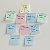
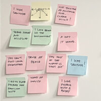
After I conducted the interviews, I spent a lot of time analyzing the data. Post-it notes were everywhere. I was hunting for themes and patterns – evidence that I could leverage for future designs. As this information began to take shape through the affinity mapping process, I found that my users’ have similar wants and need to varying degrees. The most significant and common themes are as follows:
I like fly fishing in solitude
Fly fishing gives me a sense of peace and a clear mind
I want to feel like I’m in the middle of nowhere
I enjoy exploring new waters
Fly fishing can be confusing with a large learning curve
Fly selection is difficult information to find
Safety is important and difficult info to find
The length of time of a float or wade is important
Connecting with friends is why I fly fish
Learning to tie flies and knots is time-consuming
Gear is overpriced
People don’t have time to properly research locations
Secondary Research: Internet
In addition to user interviews, I conducted an extensive search for secondary information by scouring through the internet – fishing articles about apps, industry blogs, reading reviews of the most popular fishing apps to understand what’s working and what’s not. Below are the three most significant findings from this research.
Fishing Articles: There are dozens of great fishing articles available online that rank fishing apps and give a description of what each one does well. The majority of apps available follow a social media platform and while reading them is entertaining, it’s not a reliable resource to find productive locations and it is extremely inefficient.
Industry Blogs: I’m not sure why blogs bring out the worst in people? If you’re looking to blogs for reliable fishing information you’ll be disappointed. Not only is the information unreliable, but you’ll also feel like people go out of their way to hide the best spots.
User Reviews: Users were all left wanting with the current apps available. Hidden fees, operating system bugs, and poor designs were issues with all of the apps.
“It has always been my private conviction that any man who pits his intelligence against a fish and loses has it coming.”
— John Steinbeck.
Insights
Below are the critical insights that I discovered throughout my research.
Two types of fly fisherman emerged, one that fly fishes in solitude and one that fly fished socially
There is a need for a fly fishing specific product in an oversaturated fishing app market
People don’t have time or know-how to properly research fly fishing locations
Fly fishing can be overwhelming and intimidating
People usually rely on unreliable information from fly shops, friends, and word of mouth to find fishing locations.
Competitive Research & Analysis
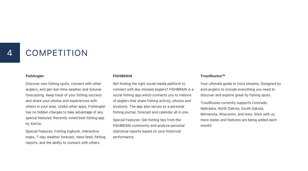
I executed an extensive Heuristic Evaluation Report on three major competitors. Hidden fees and a lack of functionality were some of the issues I found. The competition didn’t follow heuristic principles at all resulting in poor user experiences.
My findings above helped to uncover improvement opportunities for my design.
Ensure that heuristic principles are being implemented
As simple as it sounds, follow logic, especially in the organization of content
Ensure that the user has more than one way to accomplish a task
Aesthetic qualities are significant and translate to trust, confidence, and delight
Teach the user about the experience, explain the functionality


Define
Empathy Mapping
Through the empathy mapping process, it was clear that the users’ needs and wants were quite a bit different. I found that I could separate the users into two groups.
Users that fly fish in solitude: This group is extremely busy and has a very demanding and stressful job. Getting out in nature to release stress and recharges the soul is what motivates this group.
Users that fly fish socially: This group loves fly fishing with friends. Sharing experiences and being in nature is what motivates this group to fly fish.
Personas
Guided by the Empathy Map results, I developed two different users personas to best represent the needs of each user group:
Frank Trota
“Finding the time to fly fish is difficult. I’d like to know I’m maximizing my time on the water by going to the most productive locations and being prepared when I get there.”
Age: 29
Gender: Male
Job: Engineer
Status: Married
Archetype: Fly Fishes in Solitude
Jack Pesca
“I’m a fly fishing junky. Spending time with my friends in nature keeps me sane. Our group is always looking for new places to fly fish and really needs a tool to help with the research.”
Age: 36
Gender: Male
Job: Sales
Status: Married
Archetype: Fly Fishes with Friends
Ideate
Problem Statements
At this point, I’ve amassed an extensive amount of data and insight and I’m able to empathize with the user and understand their wants and needs. For me to understand the motivations and behaviors of fly fishermen I needed to understand their pain points, I wanted to speak directly with them. After screening about 25 people, I narrowed down the list and conducted structured interviews with five avid fly fishermen. The finding from these interviews will serve as the foundation of my qualitative data throughout this assignment.
User Stories & Flows
With plenty of user insight, I was able to create each story from the user’s perspective. This helped define the user’s expectations and provided clear direction for the product and its red routes. These are the three critical red routes necessary for the MVP to be viable.
Locations & Information
Becoming a pro
Tutorials
The red routes then needed to be defined sequentially, each with its own end-to-end user experience. I defined exactly what steps the user needed to take to complete each task in the simplest way possible.
Site Map
With the red routes defined and flows in hand, I was able to see how the app would begin to take shape. This helped to inform the organization of content, features, navigation, and ultimately the structure itself resulting in the site map. The resulting site map reflects a complete app experience. For the sake of this MVP, I was designing for the red routes only which account for a portion of the site map shown.
Design & Prototype
Sketching
As my sketches took shape, I built the first low fidelity prototypes, and performed guerilla testing, I quickly realized the app was going to need revisions. The test participants were able to perform some of the tasks but not without struggles. The product had issues with buttons, links, copy, and more. Back to the drawing board.
The CTA copy was not clear and left users confused
Adding a button to allow users to advance to the next screen
Clearly defining a classic account vs pro account
Wireframes & Wireflows
With the refined sketches as a guide, I began to develop the wireframe layouts for each red route. The feel of the product began to take shape in this trial and error process. I kept my wires pretty tight in their execution and incorporated some of the design details that help to define the look and feel of my product. This was another trial and error process as I continuously refined screens while applying best practices in both UI design and accessibility.
Brand Platform & Style Guide
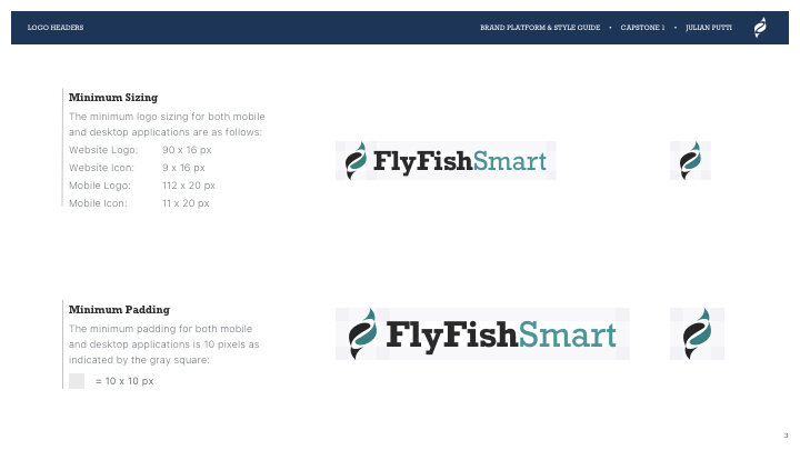
The brand’s personality and visual characteristics came to life developing the style guide. The brand platform, logo creation, color palette selection, typography choices, iconography style, UI elements, and photography style captured Fly Fish Smarts’ purpose, find fly fishing locations intelligently.


High Fidelity Mockups
Homescreen
The home screen is a hub of information for the user offering an intelligent and convenient tool for locating the most productive public access locations by species, provide step by step directions to the location, helpful tutorials on how to tie specific flies, and provide the necessary gear needed to safely and comfortably fly fish with the option to purchase the gear directly through the app.
High Fidelity Mockups
Synthesizing all of the research, user testing, and style guide components to create the UI for the product was an exciting part of the process. I wanted the app to communicate intelligence and beauty with a simple and clean layout. The navigation is logical and follows best practices. The use of a complementary color palette with nature helps define the aesthetic. Simple UI elements make it easy for the user and ensure an enjoyable experience.
Animations & Interactions
I spent time developing animation for some of the main functions by leveraging intuitive movements that mimic real-world physics – gravity, momentum, and pace. Developing motion and defining how components interact with each other is a critical part of enhancing the overall user experience.
Testing
Prototyping
Building the first prototype helped to identify a handful of issues that needed to be resolved. This process helped to discover so many little details that were missing.
Usability Testing
Usability testing was extremely useful for discovering issues and successes in the product. I learned how important testing is to the UX process and that nothing is perfect in the first or even the second iteration. Products are never completed and understanding the flaws and fixing them is the key to success.
Key learnings from usability test one:
Classic vs. Pro accounts not clear and hard to locate
Missing user location icon on map screens
CTA messaging was not clear
Design Iterations
A major portion of the app needed to be redesigned as a result of the first round of testing. User expectations for more automated functionality needed to be implemented. As a result, the onboarding process was revised to include a wardrobe setup function thereby eliminating manual uploads throughout the product for a much more streamlined experience. There were also a few design additions that helped minimize cognitive load throughout the product.
Usability Testing Round 2
After correcting the issues from the first round of the usability testing, the app performed much better. The participants were able to complete each task much easier creating a more enjoyable product to use.
Small iterations make big differences:
Update the topnav to remove the confusing lock icon.
Update the bottom navbar to show pro account was created by turning it green
Provide a point of reference on the map screens so users know where they are in location to the pins
Conclusion
Outcomes & Lessons
Outcome: Usability testing was essential in identifying critical changes with the user flow and overall design.
Lesson: Distill down every function to its essential form. In most cases, less is more.
Lesson: User friendly is defined by the user. Keep the user heavily involved throughout the process.
Outcome: The final product experience was enjoyed and praised by users and stakeholders.


